
Monday’s post on Tuesday this week, because that’s how the week is starting out, but Tudor offers two red roses (filing that one away for a future novella title, maybe a second chance at love sort of historical thing) to welcome the new month:
First Monday post of the month now belongs to a dedicated post on planners and/or planning, so let’s have a look at what’s doing it for me this month:
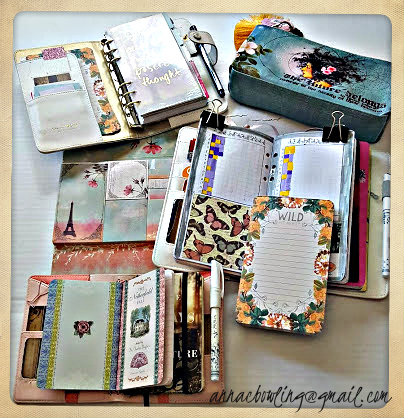
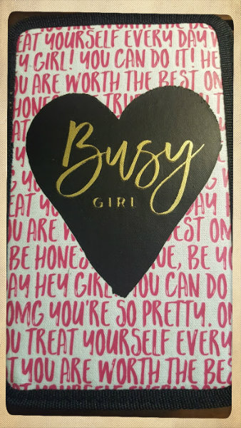
Binder and Traveler’s Notebook covers by Webster’s Pages
One thing I have come to learn about myself, and this applies to planning, reading, and writing, alike, is that, if a page is not working for me, that means there is probably not enough on it. This all coalesced earlier this week, while I was turning over my dissatisfaction with the current everyday carry…or everyday not-carry, because what I had thought was going to be smooth and streamlined, and all of the stuff that I go through periods of thinking stripped down is going to be easier than giving in to my natural maximalist tendencies. One would think I would have learned by now, but apparently not.
I like the idea of traveling light, and there is a practicality to that, but, for me, it’s not enough. I like to have a lot to look at, which carries over into my preference, especially in historical romance, both reading and writing, to have lots and lots of details, and lots and lots of layers. Give me lots and lots of colors and lots and lots of layers, and I will stay on that page, and the ones that come after it, all the livelong day, which is kind of the thing we want to have happen when writing, or planning for writing. . This is where I am currently learning that I need to bottle this kind of thing, or stick a (literal) sticky note on it, and add it to the metaphorical toolbox.
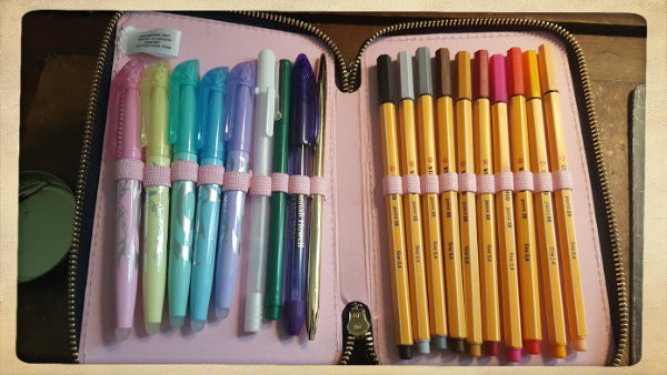
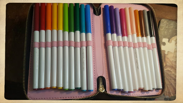
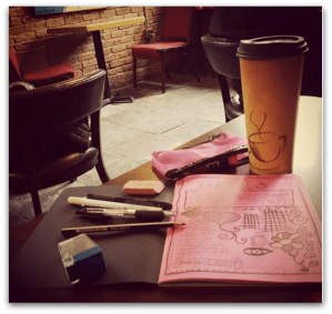
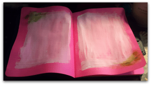
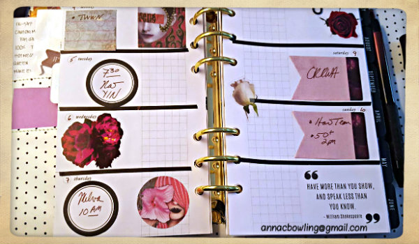
Right now, the picure below is the setup I have for the weekly section of my writing planner. I am fast coming to the end of the stickers that came with the planner kit, which means time to hunt down some more stickers and ephemera that have the same aesthetic. This part of the hunt also serves as some delicious nibbly treats for my idea hamster. Links to or recommendations for Etsy shops, Instagram accounts, etc, where I might find unusual, pretty things for my planners, are greatly appreciated, so drop them in the comments.
While I love having one binder dedicated to writing schedules and writing schedules only, having a separate notebook for more in-detail writing notes, as in actual writing about writing, listmaking and such, does not have the same appeal. What feels much more natural, though, is putting the blank monthly and weekly pages, and pages from months past, in some other sort of storage, and using that space for abovementioned notes.
This means that I have some work to do. First, I need to decide how I am going to divide that space. Fortunately, that was easy. I need four categories:
- Historical Romance
- Contemporary Romance
- Future Projects
- Blogging
Incidentally, Li’l Pink happens to have four inserts right the heck now. Hm, could this be an answer to my question above, even if it isn’t in the same binder? Only one way to tell on that front, and that is to jump right in, throw things at the page, and see how it goes. Which is kind of like writing, which is very often a sign that I am headed in the right direction.
TLDR (Too Long, Didn’t Read) version: The most-most natural way for me to go about planning, and about writing, and about keeping track of how things are going with both planning and writing (reading, as well) is to notice to what areas/themes/flavors/etc I find myself naturally drawn, and then go toward that in the way that feels most natural at the moment. Of course, this is also where discipline comes into play, which, again, is a lot less tedious when the page has lovely things on it already. Maybe the first layer isn’t enough on its own, and that is okay. Let’s add something else, and see where that takes us. Soon enough, it’s less thinking and more instinct, and hey, look how far we came. How’d that happen?
How do you figure out what sort of planning suits your individual purpose? What’s working for you right now?